CSS-Fortschrittskreis [geschlossen]


112

Ich habe diese Website durchsucht, um Fortschrittsbalken zu finden, aber diejenigen, die ich gefunden habe, zeigen animierte Kreise, die zu 100% vollständig sind.

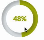
Ich möchte, dass es bei bestimmten Prozentsätzen endet, wie im folgenden Screenshot. Kann ich das auf irgendeine Weise nur mit CSS tun?

Kreisförmige Fortschrittsbalken


Ich suche kein Skript, ich suche nach CSS3-Informationen dazu.
Adam GunShy sagte am

8
Egal wie der Wortlaut lautet, die Frage "Wie mache ich den CSS-Fortschrittskreis?" Ist noch gültig. Ich denke, dies sollte mit neuem Wortlaut wieder geöffnet werden. Dieses Ergebnis steht zuerst bei der Suche und enthält veraltete Antworten.
Ciantic

Von welcher Website stammt dieser Screenshot?
MoralCode

10
Dies ist das Ergebnis Nummer eins bei Google für "Circular Progress Indicator CSS". Schade, dass die Frage geschlossen ist.
Gopherkhan

Wenn Sie WENIGER verwenden, könnten Sie an cssscript.com/pure-css-circular-percentage-bar
jchook

Antworten:


118

Ich habe ein Tutorial erstellt, wie man genau das mit CSS3 und der LESS JavaScript-Bibliothek macht. Den Blogpost finden Sie hier: https://medium.com/secoya-tech/a917b80c43f9

Hier ist eine jsFiddle des Endergebnisses. Der Prozentsatz wird über das data-progressAttribut festgelegt. Änderungen werden mithilfe von CSS-Übergängen animiert.

GIF der radialen Fortschrittsanzeige


3
Ich hatte keine Ahnung, dass Sie dies mit CSS tun könnten. Nett.
Hobbes

4
Große Leistung getroffen .. macht es für meine App unbrauchbar = [
Hobbes

2
Ausgezeichnetes Zeug. Ein kleines Problem in Firefox (unter Verwendung der Developer Edition 41.0a2) erzeugt während der Transformation sichtbare scharfe Kanten. Leicht zu erkennen, ob Sie den Fortschritt auf 90 und die Übergangszeit auf 10 Sekunden einstellen. Zum Reparieren einfach outline: 1px solid transparent;zur .mask, .fill, .shadowGruppe hinzufügen .
Luopio

5
@Hobbes, du kannst nicht, das Plakat lügt. Diese Antwort verwendet große Mengen von Javascript über eine Bibliothek namens LESS.
GetFree

6
Ich habe eine Sass-Version erstellt, nur für den Fall, dass jemand sie ausprobieren möchte: gist.github.com/digitalbreed/84a19db69244b22519e03550ba010a25
digitalbreed

76

Ich habe eine Geige nur mit CSS erstellt .

.wrapper {
  width: 100px; /* Set the size of the progress bar */
  height: 100px;
  position: absolute; /* Enable clipping */
  clip: rect(0px, 100px, 100px, 50px); /* Hide half of the progress bar */
}
/* Set the sizes of the elements that make up the progress bar */
.circle {
  width: 80px;
  height: 80px;
  border: 10px solid green;
  border-radius: 50px;
  position: absolute;
  clip: rect(0px, 50px, 100px, 0px);
}
/* Using the data attributes for the animation selectors. */
/* Base settings for all animated elements */
div[data-anim~=base] {
  -webkit-animation-iteration-count: 1;  /* Only run once */
  -webkit-animation-fill-mode: forwards; /* Hold the last keyframe */
  -webkit-animation-timing-function:linear; /* Linear animation */
}

.wrapper[data-anim~=wrapper] {
  -webkit-animation-duration: 0.01s; /* Complete keyframes asap */
  -webkit-animation-delay: 3s; /* Wait half of the animation */
  -webkit-animation-name: close-wrapper; /* Keyframes name */
}

.circle[data-anim~=left] {
  -webkit-animation-duration: 6s; /* Full animation time */
  -webkit-animation-name: left-spin;
}

.circle[data-anim~=right] {
  -webkit-animation-duration: 3s; /* Half animation time */
  -webkit-animation-name: right-spin;
}
/* Rotate the right side of the progress bar from 0 to 180 degrees */
@-webkit-keyframes right-spin {
  from {
    -webkit-transform: rotate(0deg);
  }
  to {
    -webkit-transform: rotate(180deg);
  }
}
/* Rotate the left side of the progress bar from 0 to 360 degrees */
@-webkit-keyframes left-spin {
  from {
    -webkit-transform: rotate(0deg);
  }
  to {
    -webkit-transform: rotate(360deg);
  }
}
/* Set the wrapper clip to auto, effectively removing the clip */
@-webkit-keyframes close-wrapper {
  to {
    clip: rect(auto, auto, auto, auto);
  }
}
<div class="wrapper" data-anim="base wrapper">
  <div class="circle" data-anim="base left"></div>
  <div class="circle" data-anim="base right"></div>
</div>

Überprüfen Sie auch diese Geige hier (nur CSS)

@import url(http://fonts.googleapis.com/css?family=Josefin+Sans:100,300,400);
    
.arc1 {
    width: 160px;
    height: 160px;
    background: #00a0db;
    -webkit-transform-origin: -31% 61%;
    margin-left: -30px;
    margin-top: 20px;
    -webkit-transform: translate(-54px,50px);
    -moz-transform: translate(-54px,50px);
    -o-transform: translate(-54px,50px);
}
.arc2 {
    width: 160px;
    height: 160px;
    background: #00a0db;
    -webkit-transform: skew(45deg,0deg);
    -moz-transform: skew(45deg,0deg);
    -o-transform: skew(45deg,0deg);
    margin-left: -180px;
    margin-top: -90px;
    position: absolute;
    -webkit-transition: all .5s linear;
    -moz-transition: all .5s linear;
    -o-transition: all .5s linear;
}

.arc-container:hover .arc2 {
    margin-left: -50px;
    -webkit-transform: skew(-20deg,0deg);
    -moz-transform: skew(-20deg,0deg);
    -o-transform: skew(-20deg,0deg);
}

.arc-wrapper {
    width: 150px;
    height: 150px;
    border-radius:150px;
    background: #424242;
    overflow:hidden;
    left: 50px;
    top: 50px;
    position: absolute;
}
.arc-hider {
    width: 150px;
    height: 150px;
    border-radius: 150px;
    border: 50px solid #e9e9e9;
    position:absolute;
    z-index:5;
    box-shadow:inset 0px 0px 20px rgba(0,0,0,0.7);
}

.arc-inset  {
    font-family: "Josefin Sans";
    font-weight: 100;
    position: absolute;
    font-size: 413px;
    margin-top: -64px;
    z-index: 5;
    left: 30px;
    line-height: 327px;
    height: 280px;
    -webkit-mask-image: -webkit-linear-gradient(top, rgba(0,0,0,1), rgba(0,0,0,0.2));
}
.arc-lowerInset {
    font-family: "Josefin Sans";
    font-weight: 100;
    position: absolute;
    font-size: 413px;
    margin-top: -64px;
    z-index: 5;
    left: 30px;
    line-height: 327px;
    height: 280px;
    color: white;
    -webkit-mask-image: -webkit-linear-gradient(top, rgba(0,0,0,0.2), rgba(0,0,0,1));
}
.arc-overlay {
    width: 100px;
    height: 100px;
    background-image: linear-gradient(bottom, rgb(217,217,217) 10%, rgb(245,245,245) 90%, rgb(253,253,253) 100%);
    background-image: -o-linear-gradient(bottom, rgb(217,217,217) 10%, rgb(245,245,245) 90%, rgb(253,253,253) 100%);
    background-image: -moz-linear-gradient(bottom, rgb(217,217,217) 10%, rgb(245,245,245) 90%, rgb(253,253,253) 100%);
    background-image: -webkit-linear-gradient(bottom, rgb(217,217,217) 10%, rgb(245,245,245) 90%, rgb(253,253,253) 100%);

    padding-left: 32px;
    box-sizing: border-box;
    -moz-box-sizing: border-box;
    line-height: 100px;
    font-family: sans-serif;
    font-weight: 400;
    text-shadow: 0 1px 0 #fff;
    font-size: 22px;
    border-radius: 100px;
    position: absolute;
    z-index: 5;
    top: 75px;
    left: 75px;
    box-shadow:0px 0px 20px rgba(0,0,0,0.7);
}
.arc-container {
    position: relative;
    background: #e9e9e9;
    height: 250px;
    width: 250px;
}
<div class="arc-container">
    <div class="arc-hider"></div>
    <div class="arc-inset">
        o
    </div>
    <div class="arc-lowerInset">
        o
    </div>
    <div class="arc-overlay">
        35%
    </div>
    <div class="arc-wrapper">
        <div class="arc2"></div>
        <div class="arc1"></div>
    </div>
</div>

Oder diese schöne runde Fortschrittsanzeige mit HTML5, CSS3 und JavaScript.


@panos Ich habe deine erste Lösung ausprobiert. Ich brauche .circle border, um 6px statt 10px zu sein. Ich habe das gleiche erreicht, aber als ich 50% erreicht habe. Es gibt einen Ruck und startet die Animation erneut.
Probieren Sie es

@ Santosh-kumar, du musst auch andere Werte ändern
Panos Kal.

@panos Wie würde ich den Fortschritt der ersten Lösungen ändern? könnte es mit einem Datenelement gemacht werden? Ich bin ziemlich neu in der Animation
Anthonytherockjohnson

1
Laut MDN clip ist jetzt veraltet.
Jstaab

36

Was ist damit?

HTML

<div class="chart" id="graph" data-percent="88"></div>

Javascript

var el = document.getElementById('graph'); // get canvas

var options = {
    percent:  el.getAttribute('data-percent') || 25,
    size: el.getAttribute('data-size') || 220,
    lineWidth: el.getAttribute('data-line') || 15,
    rotate: el.getAttribute('data-rotate') || 0
}

var canvas = document.createElement('canvas');
var span = document.createElement('span');
span.textContent = options.percent + '%';

if (typeof(G_vmlCanvasManager) !== 'undefined') {
    G_vmlCanvasManager.initElement(canvas);
}

var ctx = canvas.getContext('2d');
canvas.width = canvas.height = options.size;

el.appendChild(span);
el.appendChild(canvas);

ctx.translate(options.size / 2, options.size / 2); // change center
ctx.rotate((-1 / 2 + options.rotate / 180) * Math.PI); // rotate -90 deg

//imd = ctx.getImageData(0, 0, 240, 240);
var radius = (options.size - options.lineWidth) / 2;

var drawCircle = function(color, lineWidth, percent) {
        percent = Math.min(Math.max(0, percent || 1), 1);
        ctx.beginPath();
        ctx.arc(0, 0, radius, 0, Math.PI * 2 * percent, false);
        ctx.strokeStyle = color;
        ctx.lineCap = 'round'; // butt, round or square
        ctx.lineWidth = lineWidth
        ctx.stroke();
};

drawCircle('#efefef', options.lineWidth, 100 / 100);
drawCircle('#555555', options.lineWidth, options.percent / 100);

und CSS

div {
    position:relative;
    margin:80px;
    width:220px; height:220px;
}
canvas {
    display: block;
    position:absolute;
    top:0;
    left:0;
}
span {
    color:#555;
    display:block;
    line-height:220px;
    text-align:center;
    width:220px;
    font-family:sans-serif;
    font-size:40px;
    font-weight:100;
    margin-left:5px;
}

http://jsfiddle.net/Aapn8/3410/

Der Basiscode wurde aus dem Simple PIE Chart http://rendro.github.io/easy-pie-chart/ entnommen.


Dies war die beste Lösung für mich (auch keine Anfrage!).
Andy B

2
Für mich auch. So animieren Sie es: drawCircle ('# efefef', options.lineWidth, 100/100); var i = 0; var int = setInterval (function () {i ++; drawCircle ('# 555555', options.lineWidth, i / 100); span.textContent = i + "%"; if (i> = 100) {clearInterval (int);} },100);
Marlar

1
Wie setze ich Verlaufsfarben für den Kreis?
yaniv14

jsFiddle zeigt in Chrome keinen Balken an.
Esamo

10

Eine weitere reine CSS-basierte Lösung, die auf zwei abgeschnittenen, abgerundeten Elementen basiert, die ich drehe, um den richtigen Winkel zu erhalten:

http://jsfiddle.net/maayan/byT76/

Das ist das grundlegende CSS, das es ermöglicht:

.clip1 {
    position:absolute;
    top:0;left:0;
    width:200px;
    height:200px;
    clip:rect(0px,200px,200px,100px);
}
.slice1 {
    position:absolute;
    width:200px;
    height:200px;
    clip:rect(0px,100px,200px,0px);
    -moz-border-radius:100px;
    -webkit-border-radius:100px; 
    border-radius:100px;
    background-color:#f7e5e1;
    border-color:#f7e5e1;
    -moz-transform:rotate(0);
    -webkit-transform:rotate(0);
    -o-transform:rotate(0);
    transform:rotate(0);
}

.clip2 
{
    position:absolute;
    top:0;left:0;
    width:200px;
    height:200px;
    clip:rect(0,100px,200px,0px);
}

.slice2
{
    position:absolute;
    width:200px;
    height:200px;
    clip:rect(0px,200px,200px,100px);
    -moz-border-radius:100px;
    -webkit-border-radius:100px; 
    border-radius:100px;
    background-color:#f7e5e1;
    border-color:#f7e5e1;
    -moz-transform:rotate(0);
    -webkit-transform:rotate(0);
    -o-transform:rotate(0);
    transform:rotate(0);
}

und das js dreht es nach Bedarf.

ganz einfach zu verstehen ..

Hoffe es hilft, Maayan


1
In jQuery muss nicht das gesamte -vendor-prefixesInnere eingestellt werden. .css()Only Nur verwendentransform: 'rotate(' + degree + 'deg)'
Roko C. Buljan

1
Dies ist einfacher und sauberer. Ich habe ausgehend vom @ Maayan-Beispiel gearbeitet und Folgendes erhalten
lukart
Durch die Nutzung unserer Website bestätigen Sie, dass Sie unsere Cookie-Richtlinie und Datenschutzrichtlinie gelesen und verstanden haben.
Licensed under cc by-sa 3.0 with attribution required.